Inspire Me: Aradhana Seth

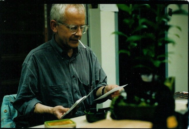
Aradhana Seth on the set of 'The Darjeeling Limited', 2007. Photo: Mark Friedberg
Aradhana Seth wears many hats: documentary writer and director, artist, photographer, curator, and more.
Here I focus on her work as production designer and art director on feature films. Seth’s range is wide: Hollywood (The Darjeeling Limited, The Bourne Supremacy, The Guru), American/European indie (West is West, Admissions, Easy), mainstream Hindi (Don, Mango), arthouse East-meets-West (Fire, Earth, Leela, Vara) and arthouse Indian (Everybody Says I’m fine, Karvaan).
I’ve had such fun working with her (as I write here). The audience may not be aware of the vast and meticulous preparation that goes into designing the look of the film. An admirer of both her art and craft, I asked Seth to share her process.

Seedling
What are your early memories related to design?
I have three. From a young age I would walk into other people’s homes and start to mentally re-design their spaces. With people I knew well, I even reconstructed their homes to match their personalities. You could say I saw them as characters in a story, though I didn’t think of this consciously at the time.
Second: I grew up in a large house where we often played hide and seek. I had to figure out where to hide, and this helped me understand the notion of space.
Third: we had a big rabbit enclosure in the garden. The rabbits multiplied really fast and they were always pooping and peeing. I liked considering the practical aspects of design and so demarcated spaces for their various activities, though they were of course obvilious to this.
Other childhood favourites?
I used to make a lot of scrapbooks. I had these large beautiful books. They were long, like legal ledgers, but with plain white paper inside. I filled them with ideas, designs, doodles and flowers. I wrote little poems and songs and drew a lot in them. I don’t know where they are now.
I’ve always seen you carry a large diary.
I’m still attached to the idea. I used to use plain notebooks until ten years ago, when I came across the [UK-based] Redstone Diary. I use them not just for my schedule but also for doodling and other ideas.

Seth's doodles and collages in her Redstone Diaries.
[An indication of how things occur in Seth's world: Redstone Diaries now feature her photography and artwork as well.]

Seth's artwork in Redstone Diaries. Above: 2015, 2013.
How did you get your first film job?
I did my Masters in Film. I was about to start on a documentary project of my own when I was asked by a friend if I wanted to work on a feature film, In Which Annie Gives It Those Ones. They had positions open only in production, but I was interested in direction. The producer called a few days later and said to meet the director, Pradip Krishen. We met and I got the job [as assistant director].
Planning the look of a film
Do you start picturing the visuals right away when you read a script?
I first read a script to see how it feels and whether it’s appealing. I don’t mark it in any way. More often than not, I read it without having had any conversations with anyone about it.
A script gives little information required for my work. It has dialogue and action. There’s not much about the visual space unless it’s relevant to the action – “he looks through a peep-hole”. It may say “messy teenager’s room”, for example, but it won’t say how it’s messy. I’m left mostly to my imagination.
If I like the script then, usually without a break, I’ll read it again. This time I’ll make notes using four different-coloured highlighters for (1) locations, (2) action props, (3) character props, (4) set dressing or clues towards it (“sits down” will indicate a sofa or a chair).
Then I’ll take the script apart and break it down completely: the spaces, rooms, furniture, foliage, artwork – the whole look and feel.

Seth's script breakdown for 'The Darjeeling Limited' fill several thick binders.
How do you create a colour palette?
I look at the story. Is it a cold story that becomes warm? Is it mostly warm with pockets of cold? A warm world would be shown using maroons, oranges and tungsten lighting.
Blues and certain lights would make it colder. Materials such as chrome, metal, stainless steel can look smart, but they read as cold on film so need to be used with care.
If you read a character’s colour as orange, for example, you could take it the extreme and make everything orange in his room, and put only Penguin classics with their orange spines on his shelves, and really push it.
White looks fantastic to the eye in real life but on film white, and especially white walls, is difficult – it has no depth. Unless used very deliberately, it looks too flat.
Some tones look awful against the skin on camera. On Don, we were using colours that had not been used very much in Hindi cinema: greens and greys. We tested different shades on the lead cast on camera at Mehboob Studios to see what looked really good on them.

Shah Rukh Khan in 'Don', 2006. Photo: Abheet Gidwani[
How do you work around time constraints?
We never have enough time on a given location or on a studio floor. The only way to do it is to measure everything precisely and make it all off-site. You need a really good workshop. When we get to location, we’re essentially assembling everything and adding final touches.

Sketch to drawing to painting. End product can be seen on ceiling of train, images below.

Design drawings for the train in 'The Darjeeling Limited'.

Final product: interior of the train in 'The Darjeeling Limited'. Photos: A Seth
How do budget constraints affect your work?
As an example: we couldn’t acquire period furniture for Earth [set in 1947]. I was scrounging around when I met Mini Boga, who ran a modern furniture company. Her father had just passed away in Amritsar and she wanted to have his things brought over to Delhi.
As a means of bartering since we couldn’t afford to rent them, we packed and transported the furniture to Delhi, where we were shooting. We refurbished them for the film: upholstered, repaired, painted, polished and added gold highlights and carvings according to the pieces’ origins. Many matched the original vision I had for the film, and a few I re-worked to make more suitable for us.
In West is West, we didn’t get new doors and age them; we got scrap wood and scaled them to fit the door frames. It’s labour intensive but cost effective. For a warehouse scene in Mango, all the tables were made from mango crates. When I have little funds, I figure out what’s essential and has the most impact, and I focus on that.

Before, during and after constructing the Khan house in 'West is West', 2010. Photos: A Seth
Do your plans change after you speak to the director?
Not really. There used to be the Satyajit Ray auteur school of filmmaking. Now, it’s largely changed – most directors leave it to the professionals they’re working with. Sometimes they’ll be very specific – “I want him to have a leather pouch that’s black in colour”. The director will often have an idea about what they don’t like, but not always about what they do. When they see what we show them, they’re usually happy to switch.

The train in 'The Darjeeling Limited'. Photo: A Seth
What was it like to work with Wes Anderson?
It was a real pleasure. He’s very keen on design and we were on the same page about the look and feel of the film. I had been working for many years with paint-on-metal hoardings, signage and miniature paintings, and was able to render and use them on this film [The Darjeeling Limited]. They’re there in every single film I’ve worked on, and it was terrific to use them on a large scale here too.
I’m happy to work within a time period when the film requires it, but I don’t want to become a slave to the period, as it’s fun to move things around. In Wes’s world, there’s a fantasy element so we had that added flexibility.
A great benefit of being the art director and not the production designer on Darjeeling meant that once we crewed the Indian team, I could focus largely on the creatives. Mark [Friedberg, production designer] put a lot of trust in me.

For 'Darjeeling', each special background extra was photographed and detailed.
Do you use a word or line that helps you keep the vision in check?
Yes. For Don, it was “cool” with everything precise, at least when we were in Don’s world.
For TheDarjeeling Limited, it was “organically grown”, where everything could be handmade.
For One Night with the King, it was “powerful”.

The set for One Night with the King (above) included constructing a winged lion 28-feet by 14-feet; 12 pillars that were 30-feet high; and two griffins on wheels that were 15-feet tall.
As production designer, you oversee the largest department on a film that encompasses art, construction, sets, props, extras, animals, vehicles and armory. What are the numbers like for your team?
Both One Night and Darjeeling had 500 people including daily labour, maybe more. The smallest was on Angry Indian Goddesses, where we were just three for art – and one was the driver we co-opted as our runner!

From the street. Photo: A Seth
The Seth touch
Signage has become a distinctive part of your design work. How did this come about?
I was always interested in it. I’ve been collecting signage from the street for a long time. In school, I’d use it for collages or rework it. When I was abroad, it had the idea of home to me. Returning to India from overseas, some people crave their favourite foods. I would want to see the stuff on the street: the hoardings, signage, shop fronts. Sadly, the hoardings are becoming more generic now, as they’re using vinyl. I don’t see the hand-painted ones as much any more. The often-skewed scale and perspective used has always been visually interesting to me. You’ll see it on shutters, shop signs, hoardings.
[Seth has used this on every film, including Fire, Earth, Bourne Supremacy, and The Guru. Below left: for West is West. Below right: John Travolta was painted Indian cinema hoarding-style for The Guru as the lead character is obsessed with the movie Grease. This piece was eventually not used in the film, though other similar artwork was.]

Insider dirt
What methods do you use for ageing construction, dressing and props?
We build a new house and then age it all down. We imagine where would the taps drip, pipes leak, door handles get shiny with use. We often use soot (mixed with other materials) to age down a kitchen.

Pre- and post-ageing the bathroom in Bourne's cottage, 'The Bourne Supremacy', 2004. Photos: A Seth
We paint a place then wash the paint down. For the outside, we muddy it with brown earth or red soil, whatever is local to the actual area where the house is meant to be.
For windows, we make sprays using hundreds of powdered spices and pigments to add a subtle textured layer to the glass. While ageing them, it also manipulates the quality and quantity of light entering through them.

Aged kitchen and exterior of Bourne's cottage, 'The Bourne Supremacy'. Photos: A Seth
We often do the obvious thing to age fabrics by dipping them in different strengths of tea.
We burn candles down and overlay the old wax with newer candles on top. We add old flowers to shrines. Sometimes we collect flowers every day of the month and ziploc them, as we need them at various stages of drying, and we can’t recreate that at the last minute.
On Everybody Says I’m Fine, we collected dozens of bags of different kinds of hair for the salon scenes. We’d show the hair on the floor, matching it to the person sitting on the chair.
Making it All Work

Do you have a routine?
Prep, shoot and post all have different rhythms. I can only make sure I start the day with coffee.
How has the discipline of designing shaped the rest of your life?
I keep my stuff organised. On a film, everything is planned down to the last detail. That’s trained me.
How would you describe your aesthetic?
Minimal and fine. Individual. Eclectic. [Above: Seth combines Ralph Lauren striped bedsheets with an Anokhi print quilt.]
You have other lives and careers; is everything else on hold when you work on a film?
I’ll take photographs when I’m looking at locations, props and set dressing. That sometimes becomes a parallel body of work. I may not make other work while on a film but I do collect inspiration.In West is West, we had a main prop of a 2-in-1 cassette player/radio for which we made a skin of a couple dancing.

Painted skin on 2-in-1, and close-up, 'West is West'. Photos: A Seth
In my art show at Chemould Prescott Road, I used that image for an artwork, but of a different couple dancing. So a real object used on a film was drawn as artwork for another. It’s real and fake, it’s mirroring and memory.

Seth's artwork, and in installation with the 'West is West' 2-in-1 prop in front.
Likewise, my personal interest in street signage feeds into my film design work. One area influences and inspires the other.
What do you know now that you wished you knew when designing your first film?
All that matters is the frame. You can get so busy with 360 degrees, but not realise that things get left out. Now I push the cool stuff into the frame.
And even then it doesn’t always get shown. On Darjeeling, across the entire length of eight bogies of the train, we had drawn 200 to 300 miniature paintings of eleghants. Big, baby, all kinds. We had elephants on the reservation charts, we had elephants on the doors. And most of them vanished. It’s tragic.
Of course, you understand things are cut for the sake of the story. But it’s really upsetting when there was so much thought put into it, and it’s deleted in the end product.

Elephants everywhere... Details of the 'Darjeeling' train. Photos: A Seth
Any final advice?
It’s critical to really enjoy the process of getting inside the heads of characters on the page. It’s your imagination alongside the director’s and the writer’s. If you create something amazing on time and under budget, they’ll go for it. Don't be afraid of sharing fresh ideas with a director.*Seth thumbprint photo on this site's homepage is by Ruchi Sehgal.

Aradhana Seth Recommends
Film
Force Majeure, directed by Ruben Östlund. It’s well-paced and visually very beautiful. I especially love that the pivotal moment of the story is shown only briefly. It’s fascinating to see human impulses, and how one gesture is so revealing.Book
BruceWagner’s book, Dead Stars, based on his original screenplay, Map to the Stars (directed by David Cronenberg). It’s a very LA book and reminds me of my time there.Photography
Everything by Graciela Iturbide.